© Lozans 2024 All Rights Reserved

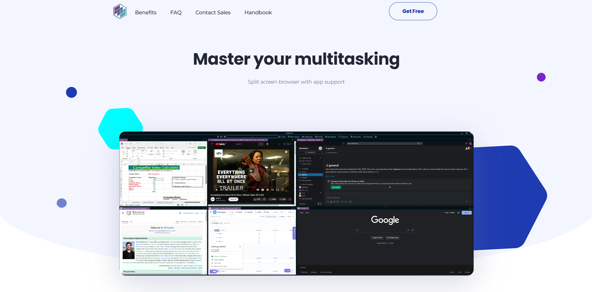
For this section of the website, the design focuses on functionality and user engagement:
1. The website features a clear, compelling headline “Master your multitasking,” which directly communicates the value proposition to the user.
2. A visual representation of a split-screen browser interface is displayed, showcasing the product’s capability and enticing users with its practical utility.
3. The design utilizes a balanced combination of abstract shapes and a harmonious color scheme to create a dynamic and modern aesthetic.
4. A prominently placed “Try Now” button serves as a direct call-to-action, encouraging immediate user interaction and exploration of the product’s features.

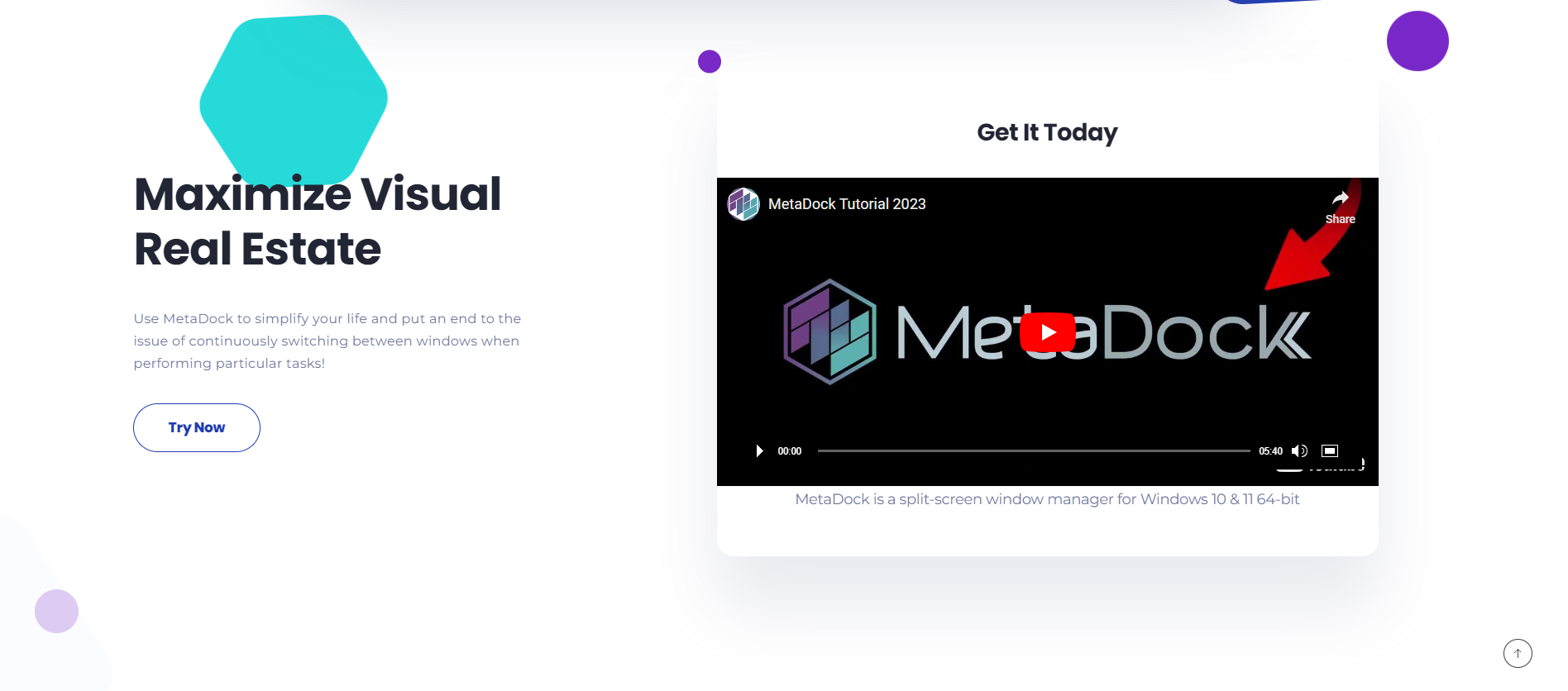
In this section of the website, the design is crafted to visually communicate the software’s utility and encourage user interaction:
1. The website presents a strong value proposition with “Maximize Visual Real Estate,” clearly indicating the benefit of using the software.
2. A graphic representation of the software in use is featured, demonstrating the product’s capability in a real-world context.
3. The design scheme is modern and clean, with a vibrant color palette that draws attention to key areas such as the “Try Now” button.
4. The inclusion of a video tutorial, prominently displayed, provides an accessible way for users to see the product in action, reinforcing its features and ease of use.

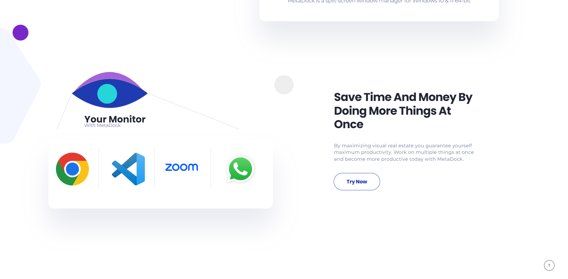
On this section of the website, the design elements work together to highlight the software’s benefits:
1. The website uses a succinct and powerful statement, “Save Time And Money By Doing More Things At Once,” to capture the core benefit of the software.
2. Iconic applications are displayed, illustrating the software’s compatibility and usefulness with popular tools.
3. The use of abstract shapes and a minimalistic approach directs the user’s attention to the central message and the ‘Try Now’ button.
4. The color palette is consistent with the brand’s theme, using whitespace effectively to create a clean and uncluttered appearance, allowing the message and call-to-action to stand out.

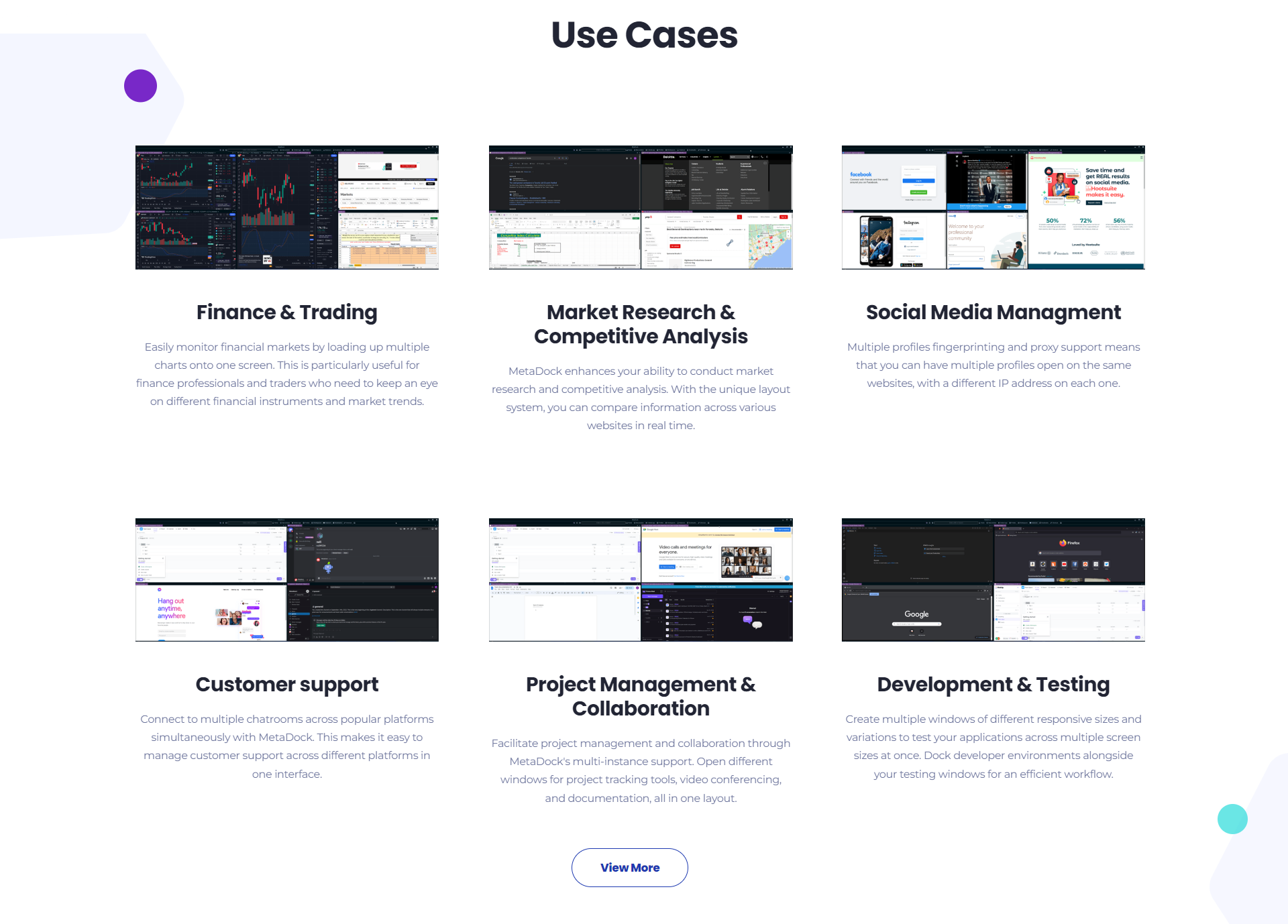
In this section of the website, the design serves to illustrate practical applications of the product:
1. The website details specific use cases like “Finance & Trading” and “Social Media Management,” demonstrating the software’s versatility.
2. For each use case, there is a corresponding visual example, which helps users to quickly understand how the software functions in different scenarios.
3. The layout is clean and organized into grids, allowing users to easily scan through the various applications of the software.
4. A “View More” button is strategically placed to invite users to explore the full range of use cases, emphasizing the depth of the software’s capabilities.

This section of the website is dedicated to building trust through customer endorsement:
1. The website features a testimonial section titled “What Our Customers Say About Us” to present real-world validation of the product’s benefits.
2. A customer quote is prominently displayed, detailing their positive experience and the impact the software has had on their productivity and workflow.
3. The design is minimalistic, allowing the testimonial message to take center stage without distraction.
4. A citation includes the customer’s name and title, adding authenticity to the testimonial and demonstrating the software’s appeal to professional users.